
We are pleased to announce our logo refresh to the MAI family. While the strong and clean shape of our logo created 13 years ago by Brazilian designer Cláudio Souto still stands the test of time, the shades of yellow and green dated it.

So, we turned to our local designer Anna Piro for a “refresh.” She helped us select the warm blue and suggested the little triangle to help contemporize our logo. The color blue can communicate traits such as trust, integrity, creativity and revealed truth. Our web designer, Joel Miller of Skyfloor, helped select a corresponding blue for digital space.
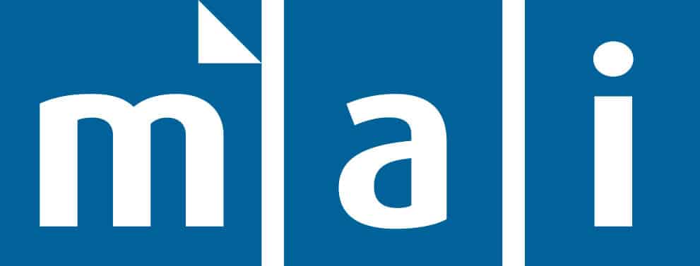
The triangular icon above the “m” is used by Kindle and elsewhere to symbolize “turn the page” and advance the story. This tiny addition helps modernize our look and subtly convey our mission: to equip and encourage Christian publishers and writers in hard places of the world to create excellent content that enriches the Church and influences society.
Ultimately, we believe this updated logo helps convey MAI’s personality in a strong, simple and versatile form that will be recognizable to friends new and old around the world.
“The world of publishing is changing, but the one constant is the need for excellent content,” MAI President John Maust said. “MA I is committed to making the Word fresh for today’s global readers, and we want to model that freshness both in images and words.”
Many thanks to our friends near and far whose feedback helped us create a fresh look.
Since our founding in 1985, MAI has led 430 training programs in 85 countries on 5 continents with 9,500 people equipped. We have seen budding writers developed, publishing houses grown, periodicals launched and books produced. We celebrate as God strengthens the Church and draws hungry readers to Christ with the written word.